
Building Responsive Layouts with Sass
Tasked with building a responsive layout system recently I developed an approach that can be broadly applied to a number of different grid-based layout systems. I am excited to share this approach with you. In addition to making clean, maintainable and compact output, this approach demonstrates how essential the @extend directive is to responsive design.
One of the biggest challenges with using preprocessors to build responsive layouts is understanding how the preprocessor interacts with media queries which are applied at runtime. Once you have that mental model in place, the structures follow quite naturally.
Philosophy
Conventional wisdom dictates that you use a fluid grid when doing a responsive design. Fluid grids are lovely from a design and interaction perspective. But a fluid grid brings additional cost to development and testing because every width is an “edge case”. So this approach accommodates your grid system of choice. You can even choose to have different grid behaviors for different medias if you needed to. However, in my most recent project I have chosen a fixed grid in order to reduce costs.
A responsive layout system must allow for a “perfect grid” for each media in question. In some media, 6 or 12 columns is desired, in other media, 24 columns or more. A perfect grid also has a gutter that feels right in all situations, the gutters should not scale very much with the width of the page, when it does it looks bad at very wide or very narrow dimensions.
One aspect I really like about OOCSS is the fractional grid system. It is extremely useful from a code maintenance and reuse perspective, but since they don’t adhere to a global grid alignment, I find them aesthetically objectionable. As a compromise I use the @extend directive to map re-useable class names to their different layout contexts allowing these fractional classes to be placed at the first level of grid nesting in any layout context.
Lastly, grids are invisible. You don’t give them backgrounds, borders, or change them in any way beyond their function as a structural element. Instead, nest elements within grid columns and assign visible aspects to a nested element called a “container”. Also note that such containers should be constructed to always fill their available width and accommodate the height of their contents.
Visualizing the Structure of a Responsive Layout System
This Sass-based layout system is made up of several layers that build upon the previous layers (and never in the other direction):
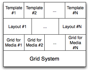
- The grid system - This module consists of mixins, functions and variables that generate classes for a per-media grid according to a naming convention. The grid it generates can be fixed, fluid, or elastic according to your needs.
- Per-media grids - A grid that only applies to a particular media.
- Responsive layouts - Layouts that work for every media.
- Per-template layout - If you want to try a purely semantic approach, each HTML template you build can build upon the previous layers. I do not use this layer and until browsers implement the
@extenddirective you shouldn’t either.
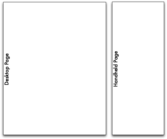
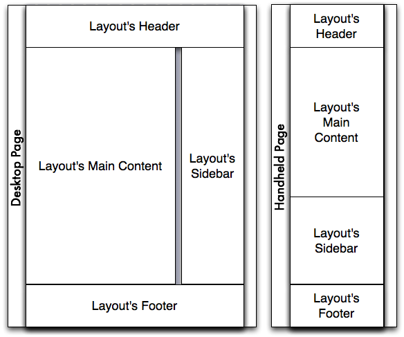
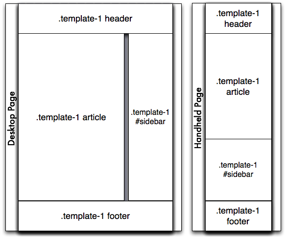
Here you can see how this structure can be used to achieve a typical two column layout with a header and footer:
Creating a Grid System
The first step is to construct a grid system that can be customized for each media. To do this we have to return to a non-semantic class name based grid system so that the @extend directive can work its magic. The grid system should generate classes according to a naming convention that makes it clear to a trained reader what the classes mean and what medias they apply to.
The grid system I made is a fixed-width grid that uses a float-based layout system. It defines a naming convention of .g-<media>-<function>. The grids mixin generates the following class structure:
.g-<media>- The base class for a grid column..g-<media>-c- The grid container..g-<media>-f- First column in a row..g-<media>-l- Last column in a row..g-<media>-<#>- A grid column that is#units wide. E.g..g-d-12.g-<media>-a<#>- Appends#grid units of padding to the right of the column..g-<media>-p<#>- Prepends#grid units of padding to the left of the column.
I don’t want to imply that this is the only approach, it’s just how I did it. The important part is the media-based naming convention. The class names are terse for a reason. When I first designed the grid I used class names like .grid-desktop-first; changing to .g-d-f and similar names make the markup easier to scan and reduces the CSS file size by about 10kb for the low cost of an increased learning curve. Here’s the Sass code I made to define the grid system – note that while I could have, I’m not using any grid library. When you have implemented as many of them as I have, it’s just as easy to build your own :)
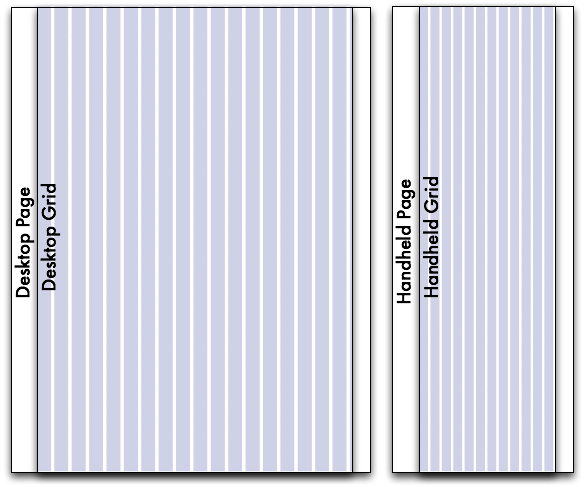
Establishing Per-Media Grids
Now that we have a grid system in place, we have to define our media types. I took inspiration from the Less Framework for the media queries I’ve used. Sass’s power was a huge help in building this system, but in the area of creating media abstraction, Sass does not yet have a great story (but neither do any of the preprocessors). We have some Sass features planned for this, but in the meantime, I am just copy & pasting my media queries when I need them – I will refactor when those features land.
Note that the trick here is to define your grid-based classes within a media block – this way when they are extended (and they will be), the subclasses will also be correctly scoped to that media and have the correct cascade. You may be tempted to invert this relationship to put @extend directives within a media block, but this will not work because media directives are interpreted on the client while the @extend directive is evaluated during compilation time. (This is a great example of why a browser-based implementation of @extend would be superior.)
At this time I’ve added support for the following medias:
Desktop/Default: d
No media query is used. But it effectively is min-width: 760px. It’s very important to make sure that your default media comes first in the source order of your stylesheets.
Handheld in landscape orientation: hl
Media Query: only screen and (min-width: 480px) and (max-width: 759px)
Handheld in portrait orientation: h
Media Query: only screen and (max-width: 479px)
The code for this media is very similar to the previous.
Adding Support for Other Medias
We intend to add support for tablets in portrait orientation soon – this approach enables having as many or as few medias as you’d like to support and makes it reasonable to add new medias to existing layouts.
Defining Media Shortcuts
Often the same behavior needs to be applied to several medias for a given element. To simply the coding of these, I created classes that extend the correct media-based classes. This means that you can simply apply the class g-all-f to an element instead of g-d-f g-hl-f g-h-f.
Constructing a Responsive Layout
Having defined our grid medias, we are ready to create a layout. Here I have also created some naming conventions:
.l-<name>- A layout.c-<name>- A column within a layout.
The definition of a full-width layout is pretty simple:
As you can see, things are starting to get pretty darn easy. Here’s the definition of a the two column layout I showed you in the beginning:
Not bad eh? This responsive layout stuff is getting fun now!
Fractional Grid Classes
As I mentioned at the start of this post, fractional class names are super cool and make my inner geek go “sqeee!” but the absence of a global grid alignment makes my inner designer go “boooo!”. What I wanted was to be able to define a class like half-column that is half of the available layout space wherever the element is contained. This allows for development of shared modules that align to the grid without knowledge of where they will be placed in a template.
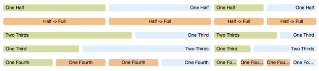
Using selector specificity and positional class names we can construct classes that have the functional behavior that we seek. I used this approach to construct the following fractional classnames:
.g-all-1of4- One fourth.g-all-1of3- One third.g-all-half- One half.g-all-half2full- One half in desktop and larger, full in smaller medias.g-all-2of3- Two thirds.g-all-full- Full width
Again, the names are terse to reduce the amount of css output. Here’s the definition of .g-all-half. As you can see it’s just a bunch of @extend directives:
Special thanks to @jaredhardy for helping me brainstorm this concept.
Going Semantic with Template Mappings
In an ideal world, we would not use presentation classes in our markup. But we do not live in an ideal world. You should be able to map your templates to your layouts like this:
But those 7 lines of Sass cause the output to bloat from 24kb to 124kb. So don’t do this until browsers support the @extend directive natively.
Demonstration
Our site has 4 layouts so far. Here’s links to see them in action:
Those links are part of Caring.com’s new living styleguide. The styleguide is mostly complete but the living documentation is still a work in progress. I will be blogging more about our styleguide’s construction as I flesh out the docs.
The Code
The code for our layout system weighs in at 721 lines of SCSS code spread across 23 small files. It generates 24kb of CSS output. I am providing a gist of this layout code for your reference in hopes that you will find it instructional. (In my code, these files are structured in directories, but gists cannot handle directories so I have flattened the file structure out.)
Please note: this is not a “boilerplate” or a “bootstrap”. I am making this code for my company and it is exactly what we need, it may or may not be what you need, but the process I have outlined is more important than the code that resulted. Your project has unique needs; use the power and flexibility of Sass to meet those needs by thinking through your requirements, crafting code that meets them, and learning more about responsive design by building out your own responsive layout system.
I look forward to hearing about how this process works for you and what different directions you take it.
Postscript: On the Subject of “Semantic” Markup
Those of you who know me well will probably do a double take after reading this post. I am using a lot of presentational class names in our new system. Has Chris given up on semantic layouts? No. But I am a pragmatist – CSS file size has to be kept in check on a site of our size. However, this approach provides solutions to many of the issues I’ve had with traditional grid systems in the past. What’s more, it is just one step away from true semantic layout approach (extending layout classes instead of using them in your markup) – but that last step is the one that bloats the output the most.
Throughout our styleguide we endeavor to create class names that describe the meaning and motivation behind the design. We were successful for many of our more visual elements, but grids and layouts didn’t have an underlying meaning that could be implemented without unacceptable bloat.
I will also point out that my startup, Caring.com, has been iterating on our design for four years now. Finding a design with the right tone for Caregivers has proven to be an exceedingly difficult challenge. As a result, our site has a trail of features that show the evolution of our learning about how our users react to different design elements. While we are still learning and experimenting, our testing shows that the design of our more recent features has really clicked with our users and so we intend to roll it out to all our legacy templates. Additionally, as our development team has grown with varying levels of UI skill, the need to provide more structure than flexibility has become apparent. Given the evolving needs of our business, we are trying a new approach. While it pained me to sacrifice my sacred cow, I understand that CSS still sucks, no matter how awesome Sass is. When a site has hundreds of page templates, a purely semantic approach breaks down. This is not a surprise to me, by the way – I knew this day would come if my company was successful, so in a certain aspect I am happy to be at this point.
That said, if browsers ever implement the @extend directive, we can truly have semantic layouts with minimal stylesheet growth per new HTML template. Please join me in calling on the W3C to implement the @extend directive natively in CSS! Tweet
About Me

I am an open source hacker and stylesheet architect at LinkedIn. I live in San Jose, California with my wife and daughter.
Open Source
I'm the creator of Compass, a stylesheet authoring framework and I'm on the core team of Sass — the stylesheet syntax upon which Compass is built. I maintain about a dozen less well known ruby libraries and rails plugins on github, and am an active contributor of patches to the many open source projects that I use.